Typography Exhibit: DING / DASH
*
Typography Exhibit: DING / DASH *
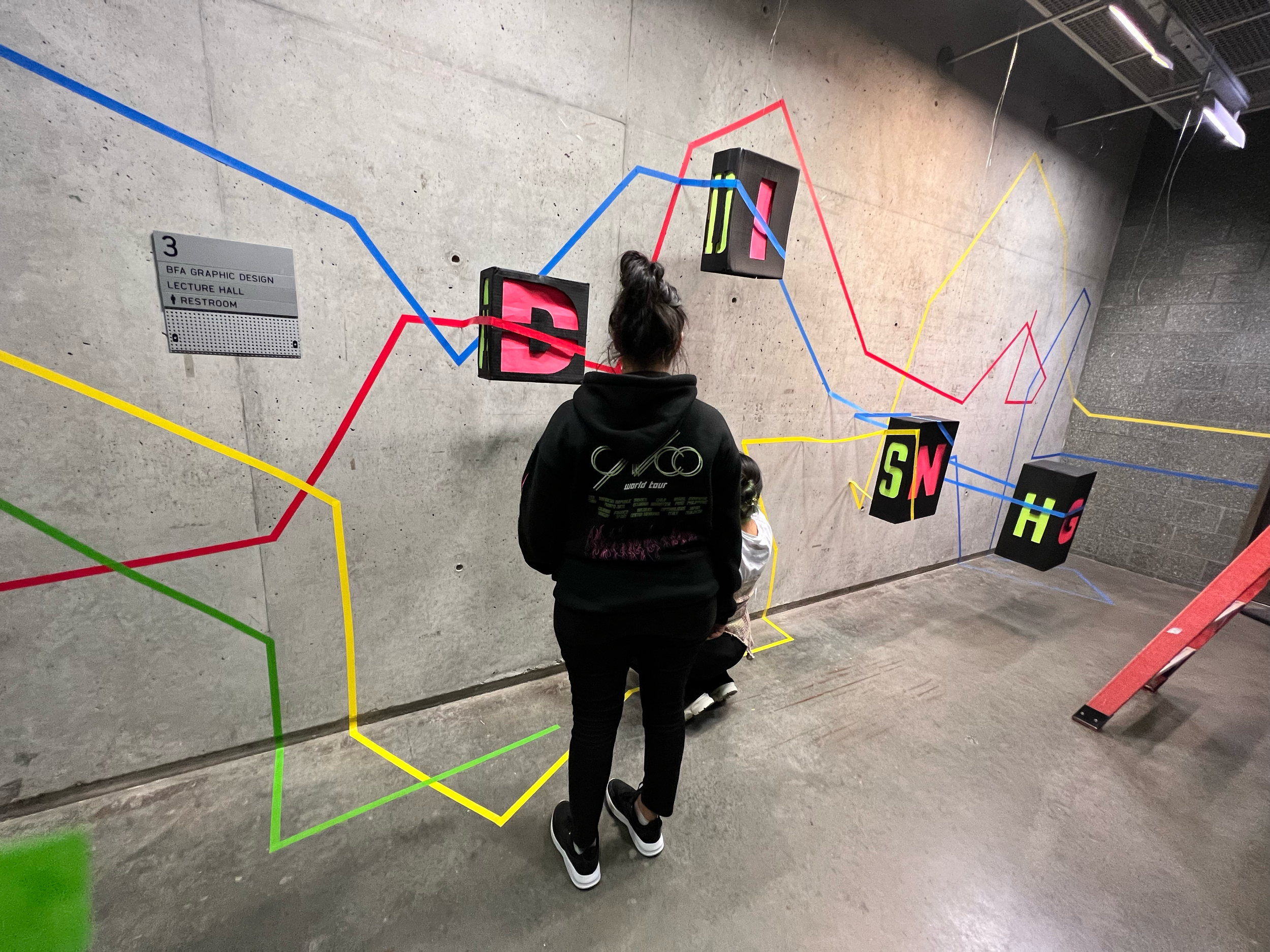
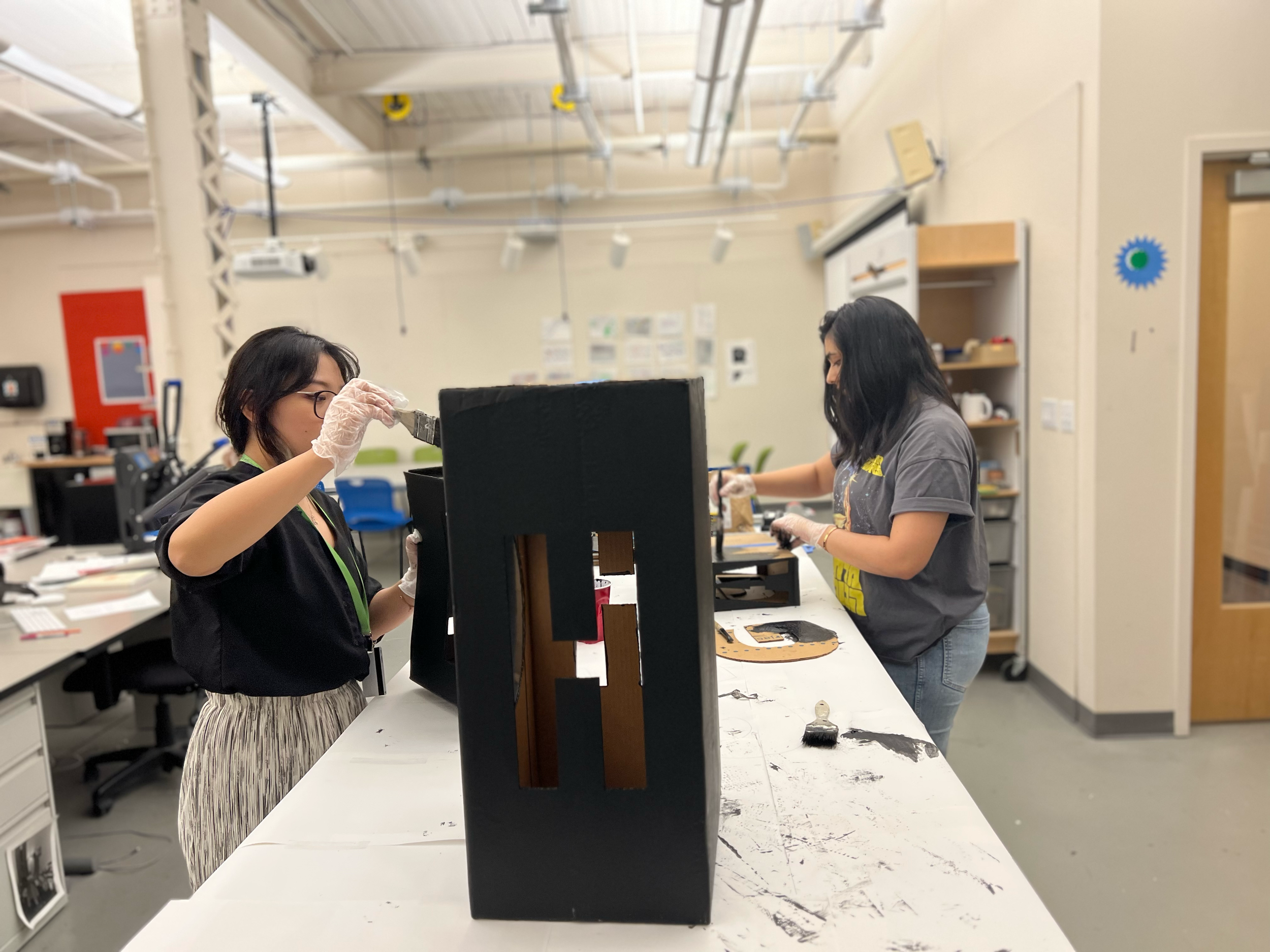
A site-specific typography installation using recycled materials, our ambigram spelled “DING” when viewed head-on and “DASH” when seen from the side—referencing the elevator chime beside the wall and playfully nudging students to hurry to class. Constructed from carved cardboard boxes, colored paper, and tape, the piece blended 2D and 3D design into an immersive experience.
In partnership with Jingyuan “Elva” Huang and Shruti Balasubramanian.
-
![]()
Ding
-
![]()
Dash
-
![]()
Shruti
-
![]()
Elva
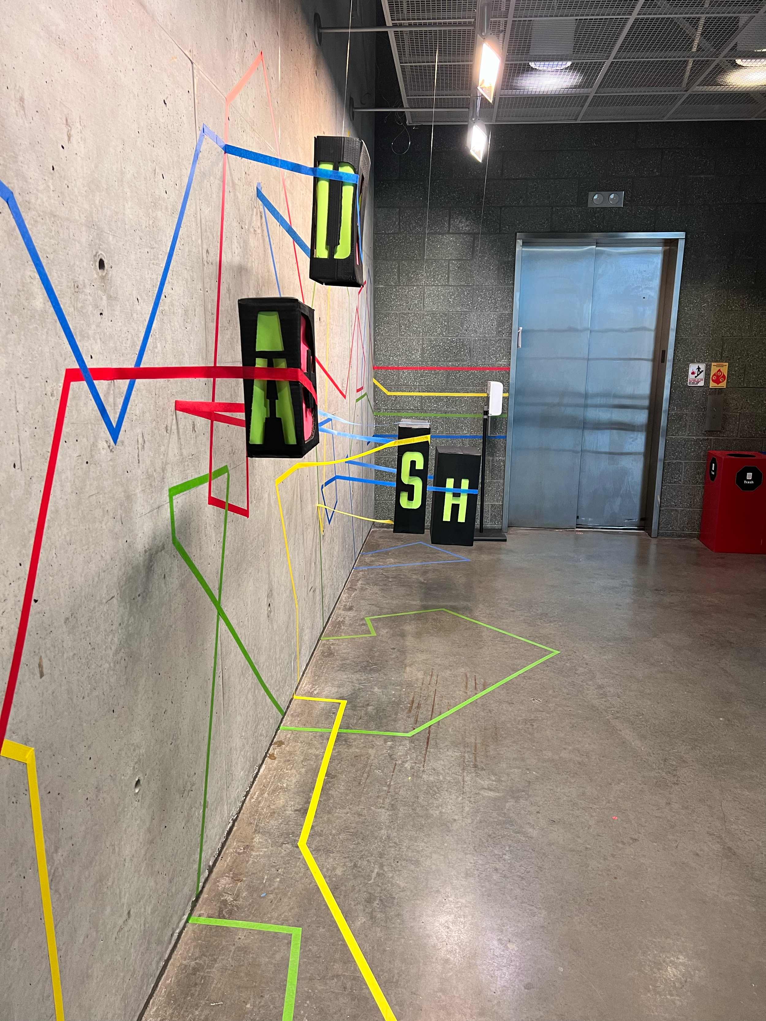

For a group exhibition project, we were challenged to design a typography-based installation using only recycled materials. Our team created a large-scale ambigram that revealed two different words depending on perspective: “DING” when read horizontally from the front, and “DASH” when read vertically from the side.
We chose these words in direct response to the installation site: a wall placed next to a notoriously slow elevator. As students exited, they would see “DING”—a playful callback to the elevator’s chime—and then “DASH” as a reminder to sprint off to class.
The piece was built from recycled cardboard boxes, with letterforms carved into three sides of each box. The interiors were lined with brightly colored construction paper to enhance legibility and fill the negative space with color, while the boxes themselves were painted black for contrast. Suspended from the rafters with fishing line, the boxes aligned precisely to form the ambigram in space.
To extend the installation into its environment, we ran colored tape across the concrete wall to resemble subway or metro lines. These lines leapt off the wall and continued across the hanging boxes, connecting the flat background with the 3D structure and creating a unified, dynamic composition.
The final result was an immersive, site-specific installation that combined recycled materials, spatial typography, and playful environmental storytelling.